Color Coordination Tips for Event Linens and Decor

Color is one of the most powerful tools in event design. It sets the mood, defines the theme, and creates a visual flow that ties every element together. Whether you’re planning a wedding, corporate event, or private celebration, choosing the right color palette—and applying it consistently across linens and décor—can elevate your event from ordinary to unforgettable.
But color coordination isn’t just about picking your favorite shades. It involves understanding how colors interact, how they influence perception, and how to use them strategically to enhance the guest experience. Here’s how to approach color coordination with confidence and creativity.
Start with a Defined Color Palette
Before selecting any linens or décor, it’s essential to establish a clear color palette. This typically includes one or two primary colors and a few complementary or accent shades. Your palette should reflect the tone of the event—soft pastels for a romantic wedding, bold jewel tones for a formal gala, or earthy neutrals for a rustic outdoor gathering.
Consider the venue’s existing colors and lighting when choosing your palette. A space with dark wood floors and warm lighting may call for lighter linens to create contrast, while a bright, modern venue might benefit from deeper, richer tones. Once your palette is set, use it as a guide for every design decision moving forward.
Use Linens as a Foundation
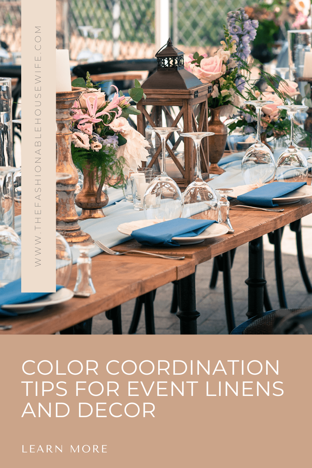
Linens are one of the most impactful ways to introduce color into your event space. Tablecloths, runners, napkins, and chair sashes all offer opportunities to reinforce your color scheme. Because linens cover large surface areas, they act as a visual foundation for the rest of your décor.
When selecting linens, think about how they will interact with your table settings, centerpieces, and lighting. A bold tablecloth can make a dramatic statement, while a neutral base allows other elements to shine. For weddings and formal events, a wedding tablecloth rental service can provide a wide range of high-quality options in various shades and textures, making it easier to find the perfect match for your theme without the commitment of purchasing.
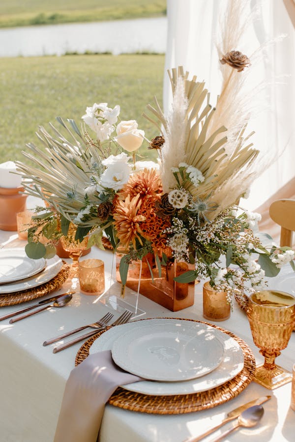
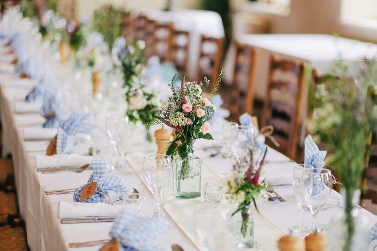
Balance Bold and Neutral Tones
A well-coordinated event design strikes a balance between bold and neutral tones. Too many vibrant colors can feel overwhelming, while an all-neutral palette may lack visual interest. The key is to use bold colors strategically—perhaps in your napkins, floral arrangements, or accent décor—while keeping larger elements like tablecloths or draping more subdued.
This approach creates contrast and depth, allowing each color to stand out without competing for attention. For example, pairing a deep navy tablecloth with gold accents and soft blush florals can create a sophisticated and harmonious look. Don’t be afraid to experiment with unexpected combinations but always test them together before finalizing your selections.
Coordinate Across All Décor Elements
Color coordination doesn’t stop at the tables. To create a truly cohesive look, your chosen palette should be reflected across all décor elements, including signage, lighting, floral arrangements, and even food presentation. Consistency is key—repeating colors throughout space helps guide the eye and reinforce your theme.
If you’re using rentals for items like lounge furniture, draping, or backdrops, be sure they align with your color scheme. Even small details like candle holders, charger plates, or menu cards can contribute to the overall aesthetic. When everything works together visually, the result is a polished and professional event design.
Consider the Guest Experience
While aesthetics is important, color coordination should also enhance the guest experience. Think about how your color choices will look in different lighting conditions, how they’ll photograph, and how they’ll make guests feel. Warm tones like amber and terracotta can create a cozy, intimate atmosphere, while cool tones like sage and lavender evoke calm and elegance.
Also consider the flow of the event. If your ceremony, cocktail hour, and reception take place in different areas, use color to create a sense of continuity. This might mean using the same accent color in each space or gradually transitioning from one shade to another to reflect the progression of the event.
Choosing Your Event Linens Matter
Color coordination is both an art and a science, and when done well, it can transform your event into a visually stunning and emotionally resonant experience. By starting with a defined palette, using linens as a foundation, balancing bold and neutral tones, and ensuring consistency across all décor elements, you can create a cohesive and memorable atmosphere. With thoughtful planning and attention to detail, your event’s color story will not only impress your guests—it will leave a lasting impression.